Objective: Design the user experience for an iPhone app that connects pet owners with certified experts.
Role: Sole UX Designer
Pet owners need a way to get expert help on many different topics quickly, since doing an online search for help can be time consuming and the information is not always reliable. Pet owners are not always able to visit their veterinarians for issues, and sometimes an in-person visit isn’t necessary. This case study explores the process involved in researching and implementing the UX design for an easy-to-use app that provides pet owners with access to pet experts that are certified in their fields.
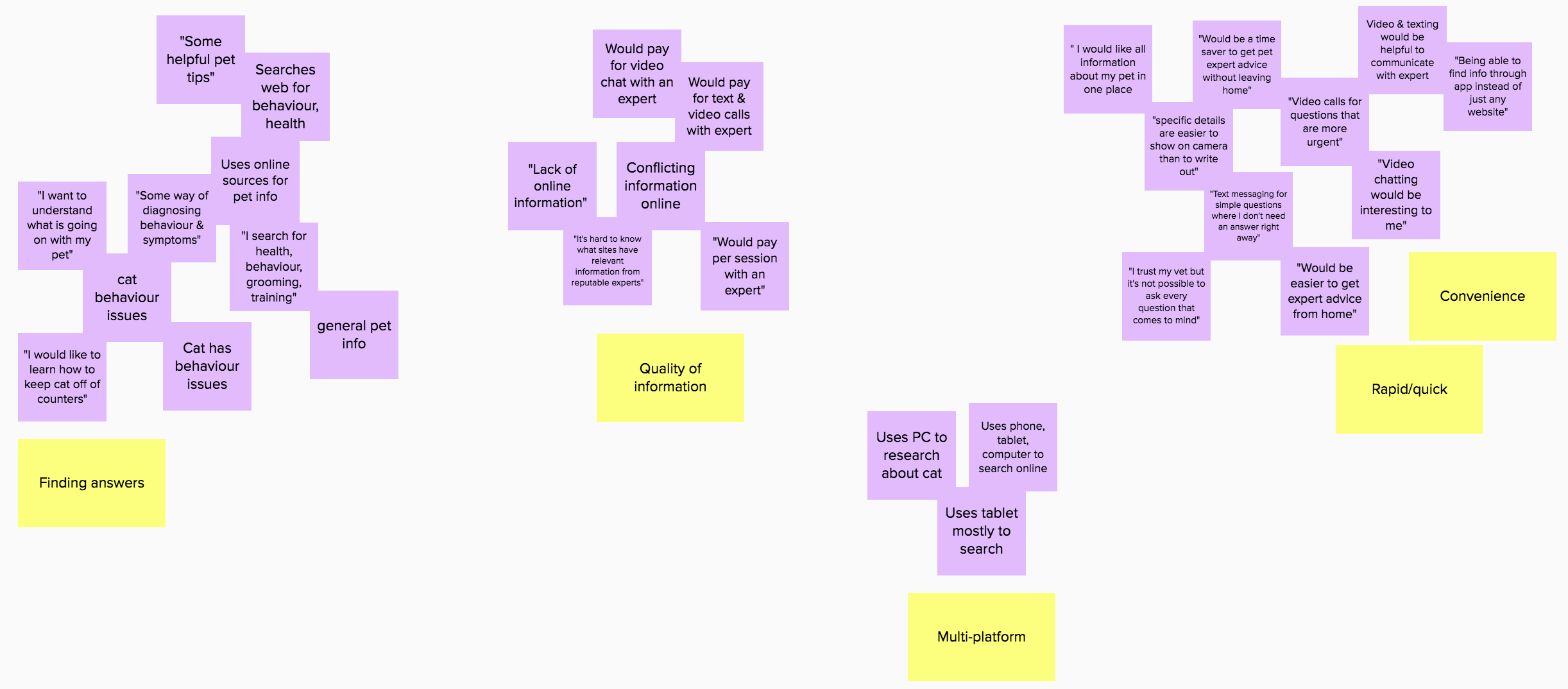
Surveys and interviews were conducted to get a more in-depth understanding of pet owner’s needs, wants, and goals. In total, three interviews were performed, and 17 participants were surveyed. Below are the insights gained.


Taking these insights from the surveys and interviews, two personas were created to to stay focused on who the users are throughout the design process. Various needs, behaviours, and frustrations were selected from each of the interviewees, whose ages were between 35-48 years old.


Based on the research up to this point, as well as the personas and user journey created, the following opportunities were identified for the app.
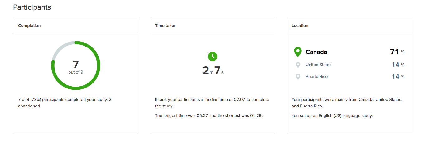
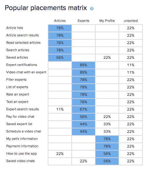
A closed digital card sort analysis was conducted that consisted of 3 categories and 19 cards to sort; this gave a better idea of where users expected to find information within the app.


Using the results from the card sort helped create the information architecture to organise the app’s content. From there, the sitemap was created, keeping the navigation simple.


The prototype was tested with six individuals; four peers reviewed it as well. Some of the insights gleaned from the results included:
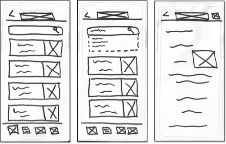
Both suggestions from peers and the results of user testing were used to iterate on the the original prototype. Below, a glimpse of some changes between the original design (on the left) and the updated version (on the right).


Photo by Artem Beliaikin on Unsplash
Photo by Ayo Ogunseinde on Unsplash
Black kitten by The Lucky Neko on Unsplash
Cat skull by Mathieu Stern on Unsplash
Russian Blue by Max Baskakov on Unsplash
Cat in bathtub by Iz & Phil on Unsplash
Curious cat by Kazuky Akayashi on Unsplash
Welcome screen by Alec Favale on Unsplash
From randomuser.me