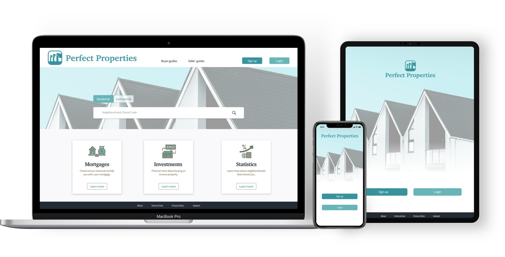
Objective: Design the UI for a responsive web app that provides property buyers with information on properties of interest.
Role: Sole UI Designer
The persona and some specific design requirements were provided, including sign-in, a properties criteria section, search, and filtering; since much of the UX research for the project was already complete, my role was to focus on UI design, respecting these guidelines as well as the persona's needs.
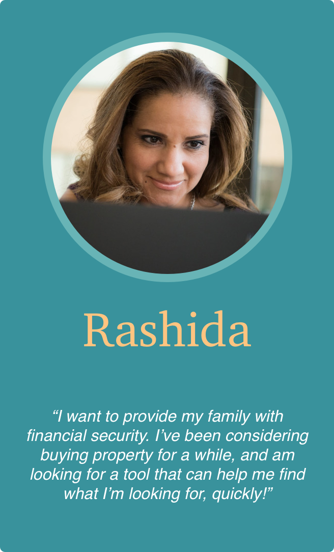
Age: 42
Gender: Female
Education: Masters degree, Computer Science
Status: Married with 2 children
As she is new to real estate, she wants a tool that is easy to use and that will help her find the property she’s looking for.

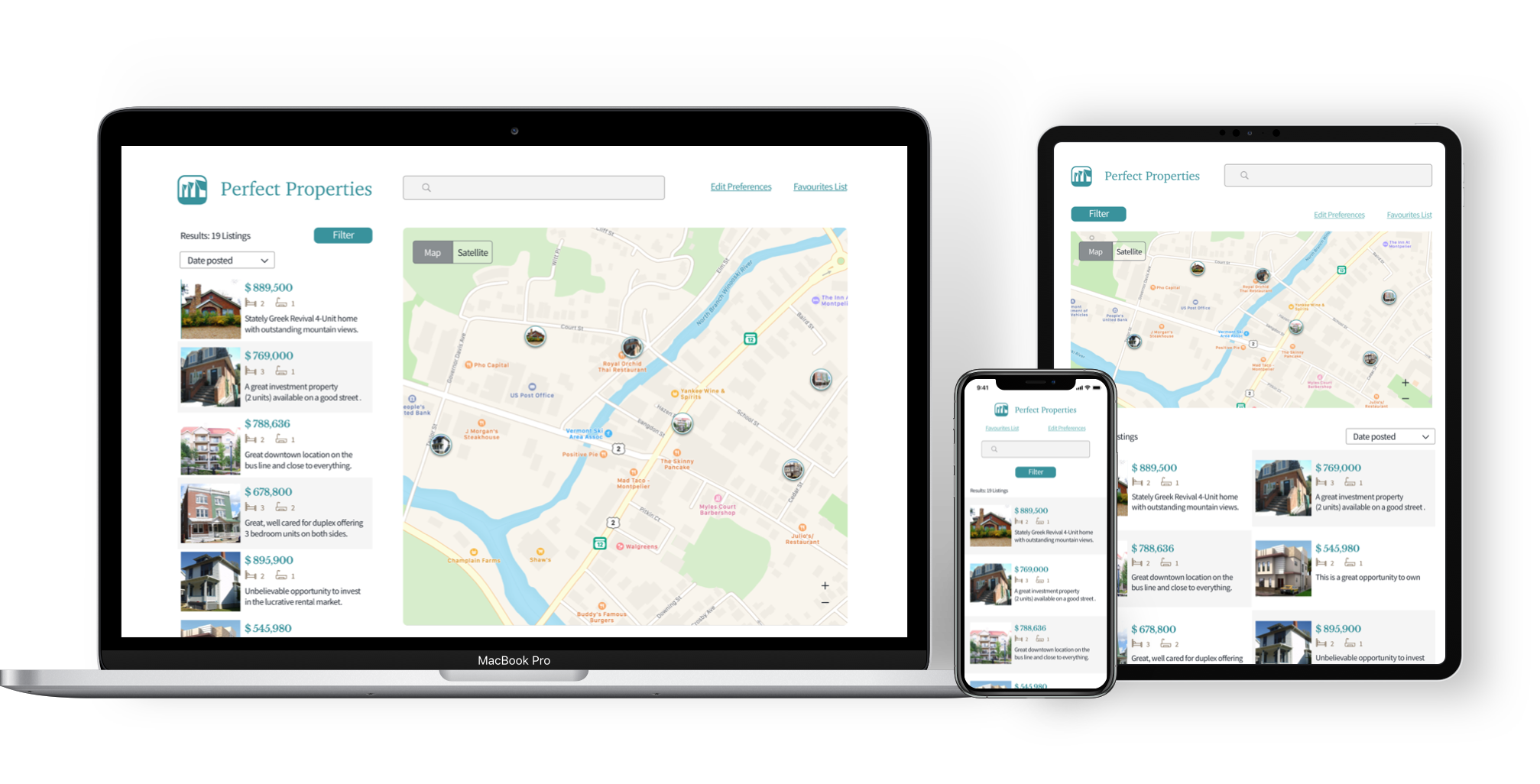
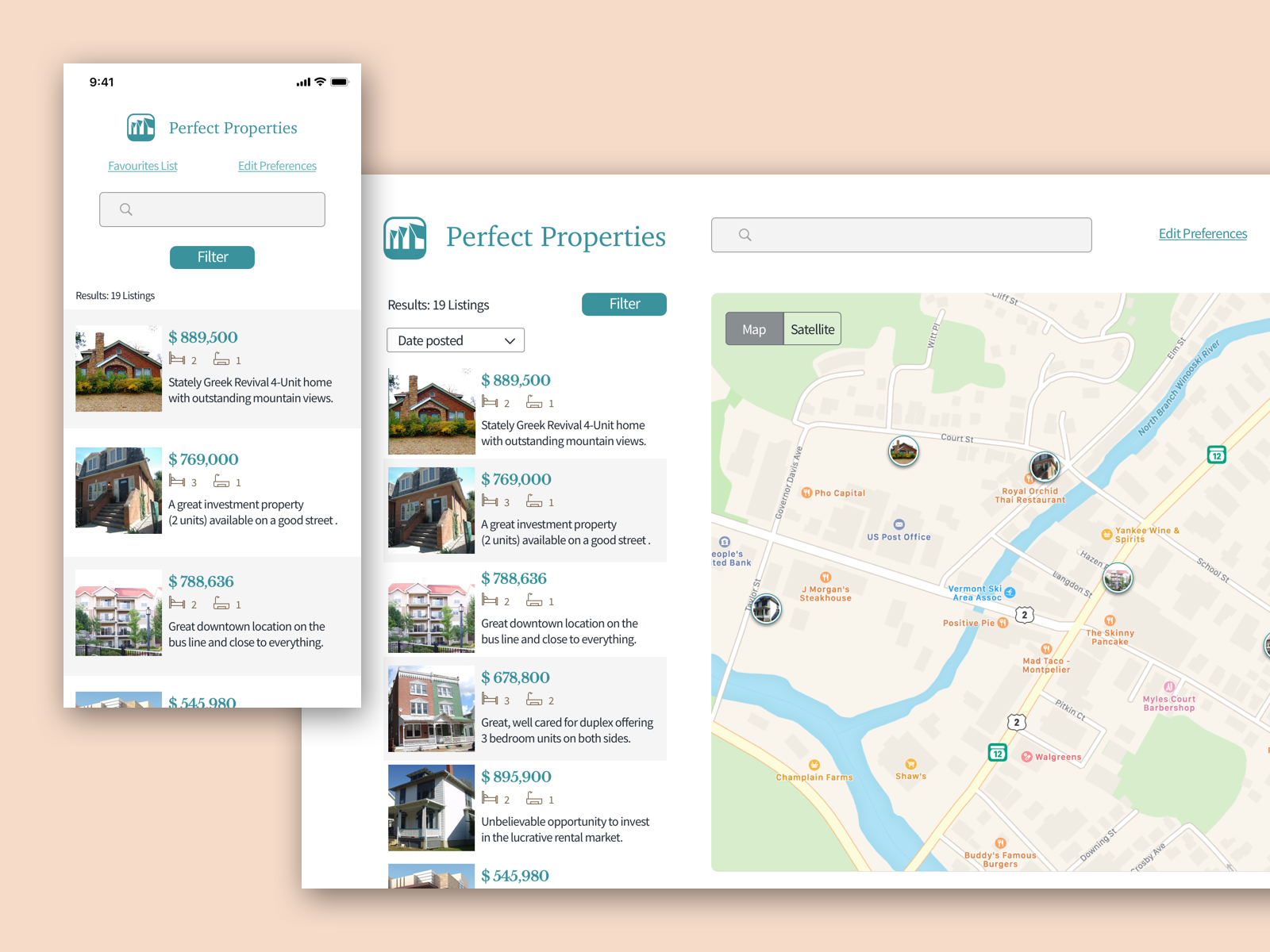
For the initial low-fidelity wireframes, I had a basic idea of what I wanted the layout to look like. The landing page pretty much stayed the same: simple, and using familiar layout that most users are at ease with. The search listings and map screens have the most evolution; while fleshing out from mid-fidelity to high-fidelity, I realized that there was information missing to make the experience more efficient and in line with what the persona needed.


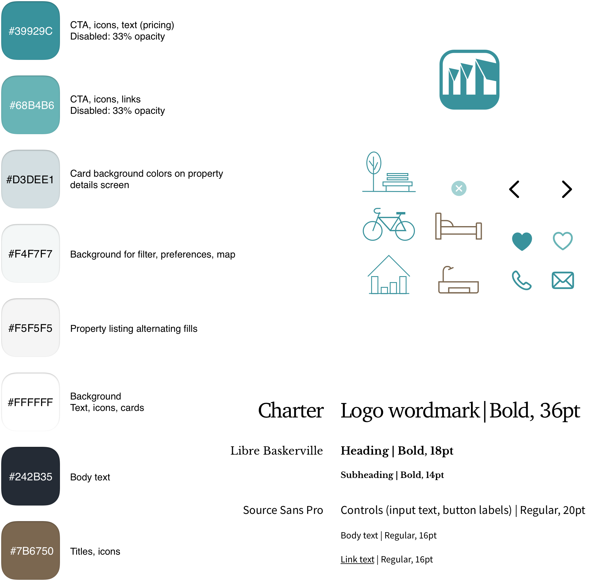
Adhering to the project brief and my persona, I drew from a palette of blues and greens to represent elegance, calmness, and growth. The brown and blue-tinted black add depth and stability to the palette.
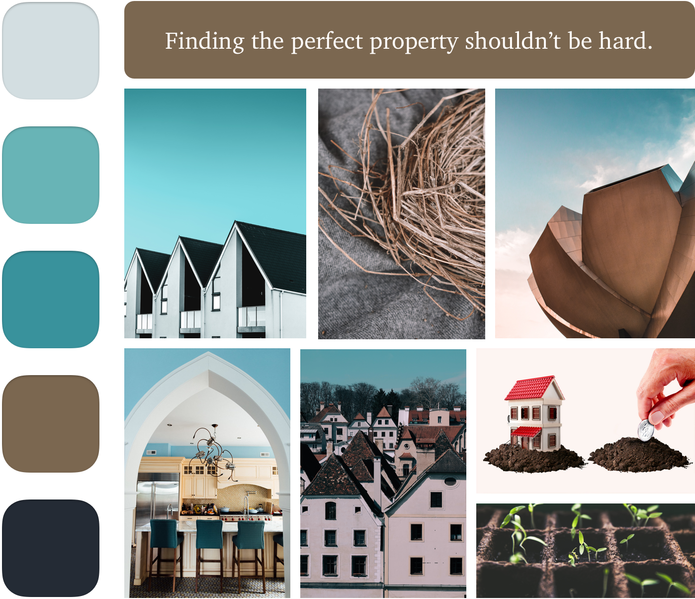
As the design evolved I further iterated on the colour palette, including a selection of tinted whites that could bridge the main brand colours with the brown and blue-tinted black. Icons were added some from templates and some I created to complement the delicate colour palette and feel of the app.
I expanded the design to accommodate multiple breakpoints, including tablet and desktop.