Objective: Design a responsive user interface for the login page of the BiteSite website.
Role: Sole UI Designer
This project involved styling the staff portal login page for BiteSite, a small firm specializing in custom software. The constraints were fairly open, requiring only that the design be responsive; an unstyled HTML page was provided for reference, shown below.


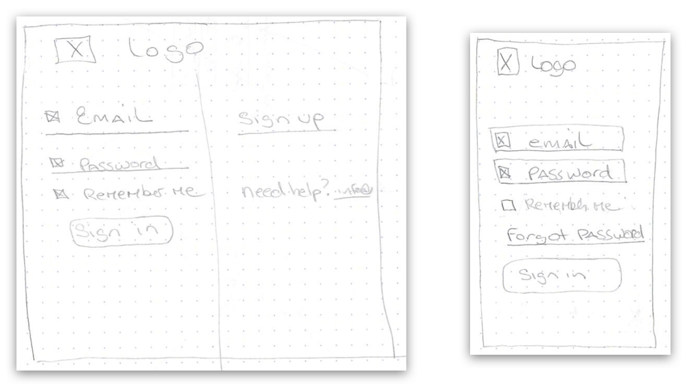
The general layout for the login page was straightforward, especially on mobile. On desktop, a two-column layout felt like a good way to separate the login form itself from the secondary content on the page.

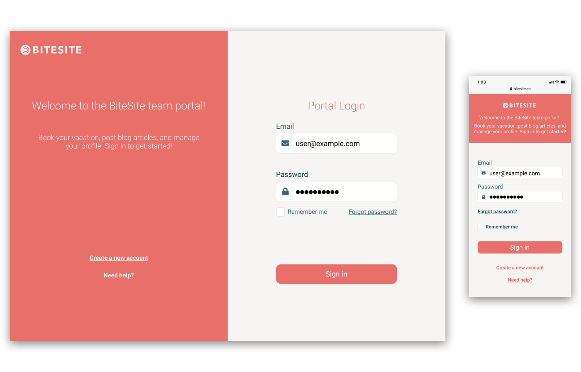
The BiteSite wordmark logo uses a dark teal, which felt important to incorporate in the palette; the challenge here was to deliver a colour palette that complemented it. Inspiration can come from the most unlikely of sources, and in this case came from a wedding photo, where the bridal party wore a similar teal and held bouquets of coral-coloured flowers.
After some iteration, the final design was submitted. The brand colour is used in the form's text and iconography, and the coral colour gives the page a vibrant, modern look when paired with clean, legible sans-serif fonts like Roboto.

